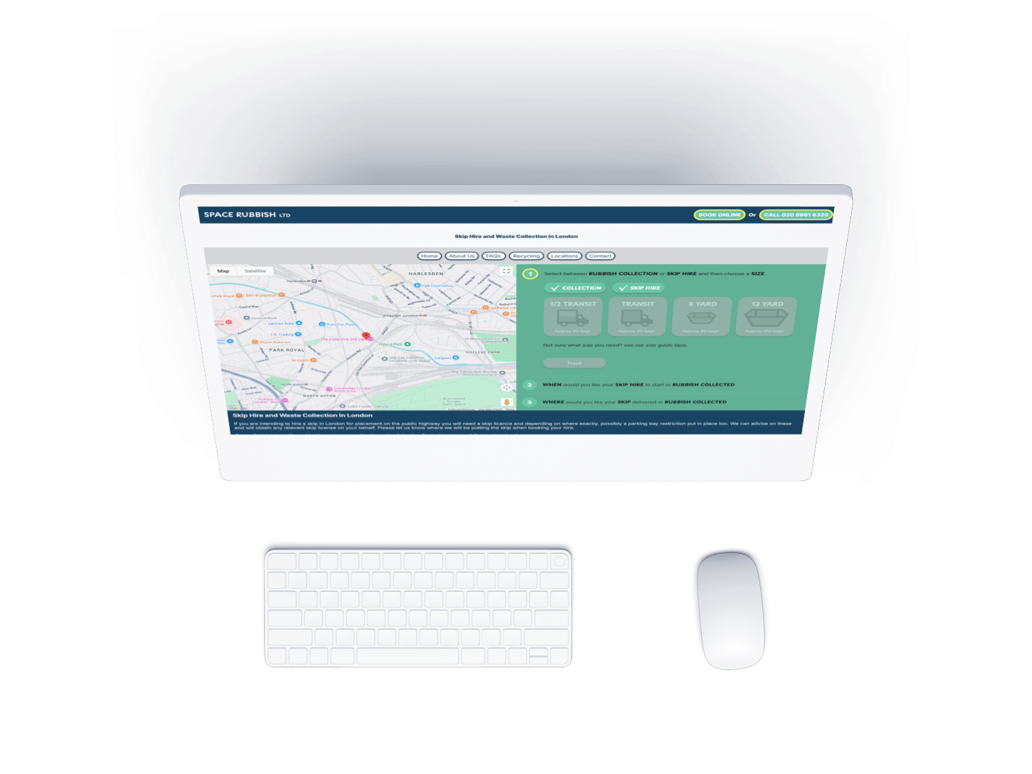
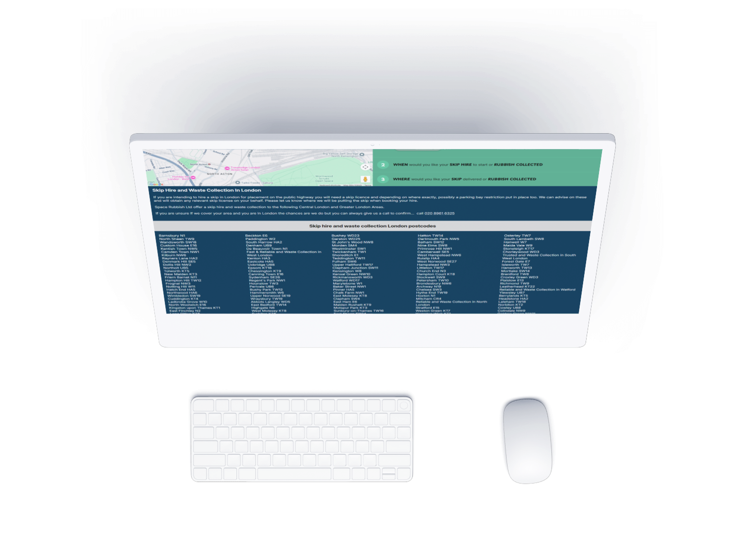
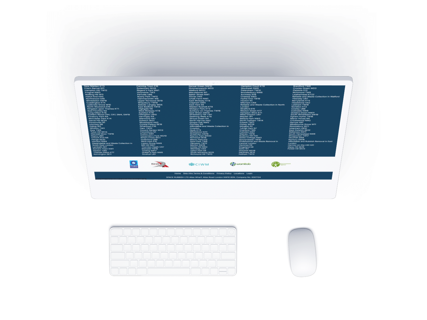
Laptop with Phoenix-SBS website

Space Rubbish Ltd

Overview of the task

The task was to create a new website for Space Rubbish, replacing their older version with a modern, user-friendly design. The primary goal of this project was to improve search engine optimisation (SEO) and enhance visibility across the various locations where the company operates. The website needed to effectively showcase their skip hire and waste removal services while aligning with best practices for SEO to attract more customers in their target areas.

Outcome:

The website delivers a significant SEO boost with over 250 unuiqe location pages. Increasing search performance by 30%. Compared to the previous version, it has also driven a 50% rise in user engagement, with notable improvements in average session duration, new user traffic, and overall retention.

ROLE

  • User Experince Design
  • User Interface Design
  • Illustrator
  • Prototyping & Testing

TOOLS

  • Figma
  • Visual Studio
  • Adobe Illustator
  • Google Anyaltics

DETAILS

Duration : 3 weeks

Company : Space Rubbish

The Process

Space Rubbish Client-Side User Flow

Space Rubbish is a multi-page website with a complex but well-structured user flow. The site features extensive content trees, covering topics from general recycling to six different recycling types, alongside 250+ unique location pages and an interactive booking form. This complexity required careful planning to ensure users could quickly find the right information. By using the user flow as the foundation for the site structure, the design prioritizes accessibility and a smooth navigation experience for all visitors.

Application Workflow Diagram
Laptop with Phoenix-SBS website

Wireframe

Space rubbish began by look and analyse current google Anyalitics for the previous itteration on users device and deciding to build for mobile and translate into desktop.

following the designs in a base for the website using html and css and impleting the previous CMS system from pheonix sbs. this resulted in a husk with place holder images and text while the developuer worked on the booking form and locations page/ interactive map.

My time spent after the precious step was creating icons illustarions and other visual aspects and copywrighting for each location page havbing unuqie text specialized for that area.

Logo desgin

Space Rubbish Logo and bringing it up to date. working with this logo was intresting as it was probably made near around time of my birth so trying to update and relate it more to the current site and brand direction of space rubbish while still paying homage to where the logo came from. we took insipration from what space rubbish provide skip and waste removal as well what they strive to have fast efficent even same day delivery.

Following this you cna see some of the materiel icons we made as well as services icons.

Application Workflow Diagram

Icon Design

Laptop with Phoenix-SBS website

Following the wireframing phase, the designs were transformed into a fully functional website. Key milestones included developing a dynamic booking form to streamline client interactions and building out over 250 unique location-specific pages. These pages were designed to expand the company’s outreach across multiple regions, improving visibility and helping to attract more clients through localized content and forms.

Locations

The locations page played a crucial role in the success of this project by significantly boosting conversion rates and attracting more clients. Additionally, it enabled effective integration with Google Ads campaigns. To achieve this success, we leveraged ChatGPT and its advanced AI capabilities to create unique, engaging content, including distinct meta descriptions and page titles. This approach not only enhanced SEO performance but also helped differentiate the site, driving more targeted traffic and increasing overall visibility.

The booking form

Following the launch of the location pages, significant effort was dedicated to refining the booking form. This involved extensive in-house testing and iterations to improve how the form operated, how it processed and output data, and how it could be optimized to guide users through the booking process more effectively. These adjustments aimed to create a smoother user journey and funnel visitors toward completing their bookings.

Application Workflow Diagram

Outcome

Main Image
Thumb 1 Thumb 2 Thumb 3

Read more of my case studies

BurgersOnDemand App

Illustration : Marketing and illustration

Law Firm Landing Page

Obelist : User research

Cooking Recipe App

Saber Soloutions : Wireframing/Prototyping